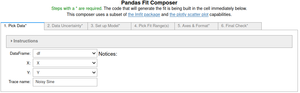
Sine fits using fit_pandas_GUI()
You can try this notebook live by lauching it in Binder.This can take a while to launch, be patient.
![]() .
.
First we import pandas, numpy and pandas_GUI and then create some data to fit.
import pandas as pd
from pandas_GUI import *
import numpy as np
X = [k*np.pi/10 for k in range(-30,30)]
Y = 98*np.sin(X)+np.random.default_rng().normal(0,3,60)
df = pd.DataFrame({'X':X, 'Y':Y})
Default plot of the data set
This is the plot made using the default settings of plot_pandas_GUI(). See step-by-step example.
# CODE BLOCK generated using plot_pandas_GUI().
# See https://jupyterphysscilab.github.io/jupyter_Pandas_GUI.
from plotly import graph_objects as go
Figure_1 = go.FigureWidget(layout_template="simple_white")
# Trace declaration(s) and trace formatting
scat = go.Scatter(x = df['X'], y = df['Y'],
mode = 'lines', name = 'Noisy Sine',)
Figure_1.add_trace(scat)
# Axes labels
Figure_1.update_xaxes(title= 'X')
Figure_1.update_yaxes(title= 'Y')
# Plot formatting
Figure_1.update_layout(title = 'Noisy Sine Wave Default Plot', template = 'simple_white', autosize=True)
Figure_1.show(config = {'toImageButtonOptions': {'format': 'svg'}})
Figure 1: A plot of the noisy sine wave data. This should display a live plotly plot. If you are running a live notebook and do not see the plot make sure you have trusted the notebook (button near the kernel name and status).
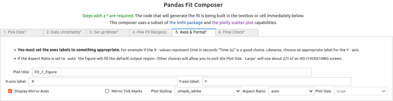
5. On the fifth tab
labels for the X and Y axis were input and the Display Mirror Axes box was checked.
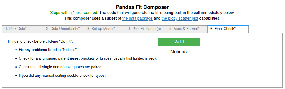
6. On the last (sixth) tab
the final checks were done and then the 'Do Fit' button was clicked, closing the GUI and running the code in the cell below to perform the fit and display the results.
# CODE BLOCK generated using fit_pandas_GUI().
# See https://jupyterphysscilab.github.io/jupyter_Pandas_GUI.
# Integers wrapped in `int()` to avoid having them cast
# as other types by interactive preparsers.
# Imports (no effect if already imported)
import numpy as np
import lmfit as lmfit
import round_using_error as rue
import copy as copy
from plotly import graph_objects as go
from IPython.display import HTML, Math
# Define data and trace name
Xvals = df["X"]
Yvals = df["Y"]
tracename = "Noisy Sine"
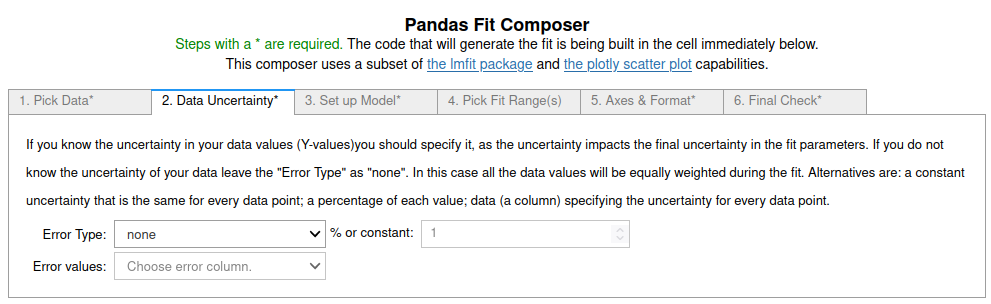
# Define error (uncertainty)
Yerr = df["Y"]*0.0 + 1.0
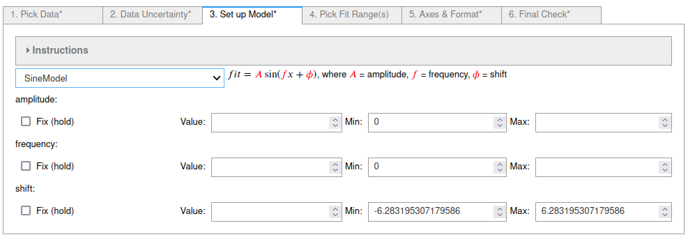
# Define the fit model, initial guesses, and constraints
fitmod = lmfit.models.SineModel()
fitmod.set_param_hint("amplitude", vary = True, value = 99.19027781700053, min = 0.0)
fitmod.set_param_hint("frequency", vary = True, value = 0.9267698328089888, min = 0.0)
fitmod.set_param_hint("shift", vary = True, value = 0.0, min = -6.283195307179586, max = 6.283195307179586)
# Do fit
Fit_2 = fitmod.fit(Yvals, x=Xvals, weights = 1/Yerr, scale_covar = True, nan_policy = "omit")
# Calculate residuals (data - fit) because lmfit
# does not calculate for all points under all conditions
resid = []
# explicit int(0) below avoids collisions with some preparsers.
for i in range(int(0),len(Fit_2.data)):
resid.append(Fit_2.data[i]-Fit_2.best_fit[i])
# Plot Results
# explicit int(..) below avoids collisions with some preparsers.
Fit_2_Figure = go.FigureWidget(layout_template="simple_white")
Fit_2_Figure.update_layout(title = "Fit_2_Figure",autosize=True)
Fit_2_Figure.set_subplots(rows=int(2), cols=int(1), row_heights=[0.2,0.8], shared_xaxes=True)
scat = go.Scatter(y=resid,x=Xvals, mode="markers",name = "residuals")
Fit_2_Figure.update_yaxes(title = "Residuals", row=int(1), col=int(1), zeroline=True, zerolinecolor = "lightgrey")
Fit_2_Figure.add_trace(scat,col=int(1),row=int(1))
scat = go.Scatter(x=Xvals, y=Yvals, mode="markers", name=tracename)
Fit_2_Figure.add_trace(scat, col=int(1), row=int(2))
Fit_2_Figure.update_yaxes(title = "Y", row=int(2), col=int(1))
Fit_2_Figure.update_xaxes(title = "X", row=int(2), col=int(1))
scat = go.Scatter(y=Fit_2.best_fit,x=Xvals, mode="lines", name="fit", line_color = "black", line_dash="solid")
Fit_2_Figure.add_trace(scat,col=int(1),row=int(2))
Fit_2_Figure.show(config = {'toImageButtonOptions': {'format': 'svg'}})
# Display best fit equation
ampstr = ''
freqstr = ''
shiftstr = ''
for k in Fit_2.params.keys():
if Fit_2.params[k].vary:
if Fit_2.params[k].stderr:
paramstr = r'({\color{red}{'+rue.latex_rndwitherr(Fit_2.params[k].value,
Fit_2.params[k].stderr,
errdig=int(1),
lowmag=-int(3))+'}})'
else:
paramstr = r'{\color{red}{'+str(Fit_2.params[k].value)+'}}'
else:
paramstr = r'{\color{blue}{'+str(Fit_2.params[k].value)+'}}'
if k == 'amplitude':
ampstr = paramstr
if k == 'frequency':
freqstr = paramstr
if k == 'shift' and Fit_2.params[k].value != 0.0:
shiftstr = ' + ' + paramstr
fitstr = r'$fit = '+ampstr + 'sin[' + freqstr + 'x' + shiftstr + ']$'
captionstr = r'<p>Use the command <code>Fit_2</code> as the last line of a code cell for more details.</p>'
display(Math(fitstr))
display(HTML(captionstr))
Use the command Fit_2 as the last line of a code cell for more details.
Figure 2: The results of fitting the noisy sine data to using default settings. Alternative formatting of line styles, markers, etc... can be accessed by editing the code produced by the GUI. Overall plot styling can be adjusted on tab 5.
Learn More
In addition to trying it below if this is a live notebook, you can look at the other examples listed in the Pandas GUI website.
Try It
If you are running this notebook live in binder you can try it here by running the first cell to import the tools and create the data. Then run the cell below to create the GUI. Note: You may want to expand the collapsed instructions to learn more about each tab.
fit_pandas_GUI()