Step-by-step making a simple plot using plot_pandas_GUI()
You can try this notebook live by lauching it in Binder.This can take a while to launch, be patient.
.
First we import pandas and pandas_GUI, and load some data. In this case we will load two time dependent Laser Induced Fluorescence (LIF) data sets.
import pandas as pd
from pandas_GUI import *
LIF = pd.read_csv('DataSets/LIF.csv')
LIF2 = pd.read_csv('DataSets/LIF2.csv')
The steps below were done after running the command plot_pandas_GUI() in an empty code cell. If you are running this notebook live you can try it yourself by running all the cells in the notebook. The last one runs the plot_pandas_GUI() command, so will create a live GUI for you to try.
1. On the first tab
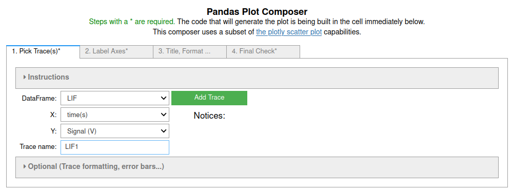
the LIF data set was selected, then the 'time(s)' column was chosen as the X-coordinate and 'Signal (V)' as the Y-coordinate using the selection boxes. The name for the trace (LIF1) was entered in the tracename box. None of the optional trace formatting options were selected. The code to add this trace to the plot was inserted into the code cell below by clicking on the 'Add Trace' button. The process was repeated, for the LIF2 data set.

3. On the third tab
the defaults were used except for checking the 'Display Mirror Axes' box. Leaving the 'Aspect Ratio' at auto causes the plot to fill the default output area for a Jupyter cell.

4. On the last, fourth, tab
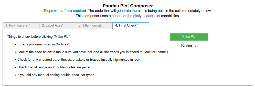
the suggestions for final checks were followed and then the 'Make Plot' button was clicked, closing the GUI and running the code in the cell below.

# CODE BLOCK generated using plot_pandas_GUI().
# See https://jupyterphysscilab.github.io/jupyter_Pandas_GUI.
from plotly import graph_objects as go
Figure_1 = go.FigureWidget(layout_template="simple_white")

# Trace declaration(s) and trace formatting
scat = go.Scatter(x = LIF['time(s)'], y = LIF['Signal (V)'],
        mode = 'lines', name = 'LIF1',)
Figure_1.add_trace(scat)
scat = go.Scatter(x = LIF2['time(s)'], y = LIF2['Signal (V)'],
        mode = 'lines', name = 'LIF2',)
Figure_1.add_trace(scat)

# Axes labels
Figure_1.update_xaxes(title= 'Time (s)', mirror = True)
Figure_1.update_yaxes(title= 'Signal (V)', mirror = True)

# Plot formatting
Figure_1.update_layout(title = 'Figure_1', template = 'simple_white', autosize=True)
Figure_1.show(config = {'toImageButtonOptions': {'format': 'svg'}})
Figure 1: This should display a live plotly plot that can be zoomed and show point values upon hovering. Note that an iconified menu turns on when you mouse over the plot. The download option will download SVG images. If you want a PNG, just use your screen capture tool. If you do not see a live plot the notebook is not running or trusted. Click on the 'Not Trusted' button in the Jupyter menu bar to trust the notebook.
Learn More
In addition to trying it below if this is a live notebook, you can look at the other examples listed in the Pandas GUI website.
Try It
If you are running this notebook live in binder you can try it here by running the first cell to import the tools and data. Then run the cell below to create the GUI. Note: You may want to expand the collapsed instructions to learn more about each tab.
plot_pandas_GUI()
