Polynomial fits using fit_pandas_GUI()
You can try this notebook live by lauching it in Binder.This can take a while to launch, be patient.
.
First we import pandas and pandas_GUI and then load some data to fit.
import pandas as pd
from pandas_GUI import *
df = pd.read_csv('DataSets/IRoscbaseline.csv.gz')
Then make a quick plot using plot_pandas_GUI() to see what the data looks like. See the Pandas GUI Website for examples and documentation on using the plotting GUI.
# CODE BLOCK generated using plot_pandas_GUI(). See https://github.com/JupyterPhysSciLab/jupyter_Pandas_GUI.
from plotly import graph_objects as go
Figure_1 = go.FigureWidget(layout_template="simple_white")
scat = go.Scatter(x = df['1/CM'], y = df['oscbase'],
mode = 'lines', name = 'IR bad baseline',)
Figure_1.add_trace(scat)
Figure_1.update_xaxes(title= '1/cm', mirror = True)
Figure_1.update_yaxes(title= 'Absorbance', mirror = True)
Figure_1.update_layout(title = 'Figure_1', template = 'simple_white')
Figure_1.show(config = {'toImageButtonOptions': {'format': 'svg'}})
Figure 1: IR spectrum of ethane with an oscillating baseline.
Fitting the baseline to a polynomial
Looking at this spectrum it appears that the baseline oscillates through zero three time, so a good place to start is to try fitting it to a cubic polynomial.
Start by launching the fitting GUI by putting the command fit_pandas_GUI() in an empty cell and running the cell.
1. On the first tab
the data set and a name for the trace is set. See the screenshot below.

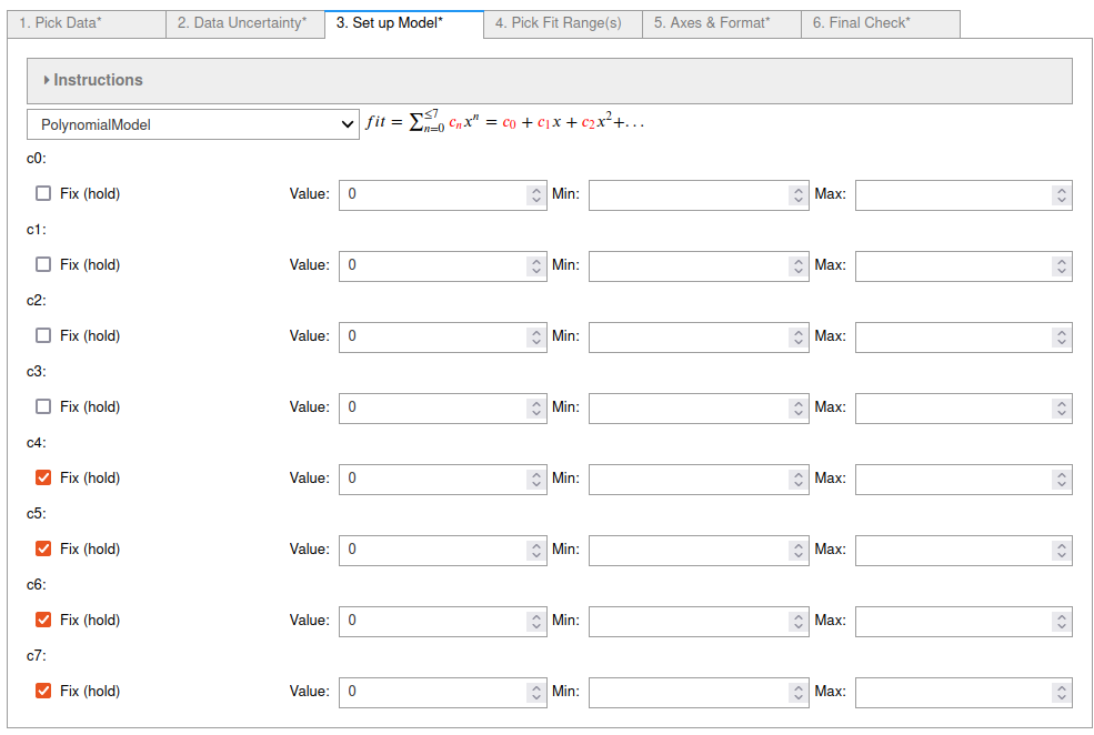
3. On the third tab
"PolynomialModel" was chosen from the popup menu and coefficients c4 - c7 were fixed at the default value of zero so terms of order higher than 3 were ignored. See the screenshot below.

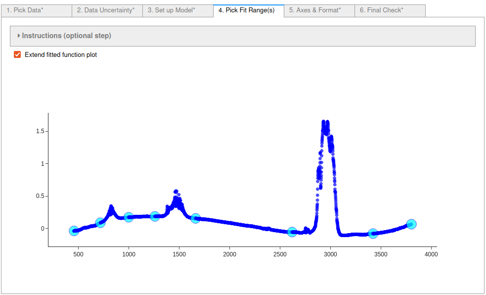
4. On tab 4
the ranges of the data to fit to were chosen to ignore the peaks. Consecutive pairs of selected points starting with the lowest data index number define each range. Points can be deselected by holding down the ctrl key while clicking on a point.
The Extend fitted function plot box was also checked so that the fit is shown in the ignored regions.
See the screenshot below.

5. On the fifth tab
labels for the X and Y axis were input and the Display Mirror Axes box was checked.

6. On the last (sixth) tab
the final checks were done and then the 'Do Fit' button was clicked, closing the GUI and running the code in the cell below to perform the fit and display the results.

# CODE BLOCK generated using fit_pandas_GUI().
# See https://jupyterphysscilab.github.io/jupyter_Pandas_GUI.
# Integers wrapped in `int()` to avoid having them cast
# as other types by interactive preparsers.
# Imports (no effect if already imported)
import numpy as np
import lmfit as lmfit
import round_using_error as rue
import copy as copy
from plotly import graph_objects as go
from IPython.display import HTML, Math
# Define data and trace name
Xvals = df["1/CM"]
Yvals = df["oscbase"]
tracename = "IR with bad baseline"
# Define error (uncertainty)
Yerr = df["oscbase"]*0.0 + 1.0
# Define the fit model, initial guesses, and constraints
fitmod = lmfit.models.PolynomialModel()
fitmod.set_param_hint("c0", vary = True, value = 0.0)
fitmod.set_param_hint("c1", vary = True, value = 0.0)
fitmod.set_param_hint("c2", vary = True, value = 0.0)
fitmod.set_param_hint("c3", vary = True, value = 0.0)
fitmod.set_param_hint("c4", vary = False, value = 0.0)
fitmod.set_param_hint("c5", vary = False, value = 0.0)
fitmod.set_param_hint("c6", vary = False, value = 0.0)
fitmod.set_param_hint("c7", vary = False, value = 0.0)
# Define fit ranges
Yfiterr = copy.deepcopy(Yerr) # ranges not to fit = np.inf
Xfitdata = copy.deepcopy(Xvals) # ranges where fit not displayed = np.nan
Yfiterr[int(0):int(11)] = np.inf
Xfitdata[int(0):int(11)] = np.nan
Yfiterr[int(274):int(560)] = np.inf
Xfitdata[int(274):int(560)] = np.nan
Yfiterr[int(917):int(1296)] = np.inf
Xfitdata[int(917):int(1296)] = np.nan
Yfiterr[int(2343):int(3112)] = np.inf
Xfitdata[int(2343):int(3112)] = np.nan
Yfiterr[int(3554):int(3571)] = np.inf
Xfitdata[int(3554):int(3571)] = np.nan
# Do fit
Fit_1 = fitmod.fit(Yvals, x=Xvals, weights = 1/Yfiterr, scale_covar = True, nan_policy = "omit")
# Calculate residuals (data - fit) because lmfit
# does not calculate for all points under all conditions
resid = []
# explicit int(0) below avoids collisions with some preparsers.
for i in range(int(0),len(Fit_1.data)):
resid.append(Fit_1.data[i]-Fit_1.best_fit[i])
# Plot Results
# explicit int(..) below avoids collisions with some preparsers.
Fit_1_Figure = go.FigureWidget(layout_template="simple_white")
Fit_1_Figure.update_layout(title = "Fit_1_Figure",autosize=True)
Fit_1_Figure.set_subplots(rows=int(2), cols=int(1), row_heights=[0.2,0.8], shared_xaxes=True)
scat = go.Scatter(y=resid,x=Xvals, mode="markers",name = "residuals")
Fit_1_Figure.update_yaxes(title = "Residuals", row=int(1), col=int(1), zeroline=True, zerolinecolor = "lightgrey", mirror = True)
Fit_1_Figure.update_xaxes(row=int(1), col=int(1), mirror = True)
Fit_1_Figure.add_trace(scat,col=int(1),row=int(1))
scat = go.Scatter(x=Xvals, y=Yvals, mode="markers", name=tracename)
Fit_1_Figure.add_trace(scat, col=int(1), row=int(2))
Fit_1_Figure.update_yaxes(title = "Absorbance", row=int(2), col=int(1), mirror = True)
Fit_1_Figure.update_xaxes(title = "1/cm", row=int(2), col=int(1), mirror = True)
scat = go.Scatter(y=Fit_1.best_fit, x=Xvals, mode="lines", line_color = "black", name="extrapolated",line_dash="dash")
Fit_1_Figure.add_trace(scat, col=int(1), row=int(2))
scat = go.Scatter(y=Fit_1.best_fit,x=Xfitdata, mode="lines", name="fit", line_color = "black", line_dash="solid")
Fit_1_Figure.add_trace(scat,col=int(1),row=int(2))
Fit_1_Figure.show(config = {'toImageButtonOptions': {'format': 'svg'}})
# Display best fit equation
fitstr = r'$fit = '
termcount = int(0)
for k in Fit_1.params.keys():
pwr = int(str(k)[int(-1):])
if Fit_1.params[k].vary:
if termcount > int(0):
fitstr += ' + '
fitstr += r'({\color{red}{'+rue.latex_rndwitherr(Fit_1.params[k].value,
Fit_1.params[k].stderr,
errdig=int(1),
lowmag=-int(3))+'}})'
if pwr == int(1):
fitstr += 'x'
if pwr > int(1):
fitstr += 'x^'+str(pwr)
termcount+=int(1)
else:
if Fit_1.params[k].value!=0.0:
if termcount > int(0):
fitstr += '+'
fitstr += r'({\color{blue}{'+str(Fit_1.params[k].value)+'}})'
termcount +=int(1)
if pwr == int(1):
fitstr += 'x'
if pwr > int(1):
fitstr += 'x^'+str(pwr)
fitstr+='$'
captionstr=r'<p>Use the command <code>Fit_1</code> as the last line of a code cell for more details.</p>'
display(Math(fitstr))
display(HTML(captionstr))
Use the command Fit_1 as the last line of a code cell for more details.
Figure 2: The results of the fit. Notice that the cubic polynomial was a very good choice. All the parameters appear to have three or four significant figures based on the uncertainties. Zooming in around zero on the residuals shows how well this flattens the baseline. Despite the good baseline correction the spectrometer or sampling methods really need fixing...
Plot of the spectrum with the baseline removed
As the residuals are just the spectrum with the fit subtracted from it we can use that as the corrected spectrum. If I were going to continue working with this spectrum I would add the corrected spectrum to the data frame. I am going to do that below, because it is easiest to make a plot from a data frame using plot_pandas_GUi().
df['corrected'] = resid
# CODE BLOCK generated using plot_pandas_GUI(). See https://github.com/JupyterPhysSciLab/jupyter_Pandas_GUI.
from plotly import graph_objects as go
Figure_3 = go.FigureWidget(layout_template="simple_white")
scat = go.Scatter(x = df['1/CM'], y = df['corrected'],
mode = 'lines', name = 'Baseline Corrected IR',)
Figure_3.add_trace(scat)
Figure_3.update_xaxes(title= '1/cm', mirror = True)
Figure_3.update_yaxes(title= 'Absorbance', mirror = True)
Figure_3.update_layout(title = 'Figure_3', template = 'simple_white')
Figure_3.show(config = {'toImageButtonOptions': {'format': 'svg'}})
Figure 3: Plot of the baseline corrected spectrum that was added to the data frame from the residuals of the polynomial fit.
Learn More
In addition to trying it below if this is a live notebook, you can look at the other examples listed in the Pandas GUI website.
Try It
If you are running this notebook live in binder you can try it here by running the first cell to import the tools and load the data. Then run the cell below to create the fit GUI. Note: You may want to expand the collapsed instructions to learn more about each tab.
fit_pandas_GUI()
